Anne Boleyn’s Moost Happi Portrait Medal…revisited

For a background to the medal’s history, my research and reconstruction process read:
my original 2012 blogpost about the Moost Happi medal and my reconstruction

1aoriginal_anne_boleyn_moost_happi_medal_british_museum

On Thursday 24th November historian Tracy Borman will host a documentary on Channel 5 – ‘The Fall of Anne Boleyn’. Borman takes several fresh approaches, including an interview with me and a detailed examination of The Moost Happi medal – the only certain portrait of Anne Boleyn made during her lifetime still in existance.

In reviewing my notes I came to a more focussed conclusion – that its purpose goes far beyond a mere celebration of her pregnancy. To see the medal as a celebration of her fertility is to look at it from a modern perspective – (as if it were a baby-shower trinket). Instead I believe the medal a masterstroke of political propaganda, demonstrating Anne’s sense of strategy and skill with visual imagery. Her aim – not just to reinforce her own legitimacy as queen, but her unborn child’s right to rule the English throne.

The key to this theory lies with her choice of headdress – a Gable Hood.
It is often said that Anne favoured the French Hood (based more on later paintings and Hollywood depictions than contemporary evidence which indicates she owned both). But when it mattered, when she wanted to declare that she was Queen of England – Anne wore a Gable Hood. This is recorded on the day of her execution at the Tower of London, and in this medal.
(See also The Black Garter Scroll depiction:  https://www.theanneboleynfiles.com/update-anne-boleyn-lady-garter-image/)

I believe that this particular outfit, recorded in the medal in exquisite detail, was of great importance. It comprised of a bejewelled Gable Hood, a matching necklace (with a choice pendants), a jewelled belt and dress (the latter not worn for the medal portrait, presumably due to Anne’s enlarged belly). For reference, you can look at the full outfit worn not long afterwards by Anne’s successor, Jane Seymour, as depicted by Holbein.

The portraits of Henry’s wives show that they all had access this ensemble as queen. But until this point, it had belonged to Catherine alone. Without the softening gaze of hindsight this act of appropriation was a strong visual challenge. By wearing the Gable Hood and jewels, clearly a prized part of the queen’s wardrobe, Anne was stating ; ‘I am Queen of England now’.

More than this – Anne’s pregnant state is celebrated – her bosom, recorded as being ‘not much raised’, is very much emphasised in the medal. I believe that there was purpose to this too:
In 1533 Anne was crowned on the throne in Westminster Abby wearing the Crown of St Edward so that the child in her belly might be crowned also. However the right of that child to rule was tenuous. The baby conceived out of wedlock and before Anne’s coronation, and besides, a daughter was not regarded as an heir to the throne then. Elizabeth’s legitimacy could be easily disputed. It was therefore crucial to emphasise that Anne was both Henry’s wife and Queen of England in 1534 when it was believed to be carrying a male heir.

The Moost Happi medal is not just a record of how Anne Boleyn herself wanted to be viewed, but an example of her mastery of powerful visual messages. Her choice of Gable Hood boldly states:
“I am Queen of England. I am the mother of the legitimate heir to the Tudor throne”.

It’s wonderful to reflect that, after the tragic dance of many of these players, Anne Boleyn was indeed the mother of England’s most famous and loved monarch: Elizabeth 1, an equally strong woman who inherited her mother’s understanding of the power of symbolism.

Read my 2012 blogpost about the Moost Happi medal and my reconstruction

1_anne_boleyn_medal_gwill_shot


Buy a copy of my reconstruction
Individually made copies in bronze resin are available (150mm / 38mm)
Pendants in a choice of metals are also available

Reviews for my reconstruction:
‘Lucy Churchill’s brilliant achievement has brought us as close to the real Anne Boleyn as we shall ever be able to get’.
Eric Ives, OBE
‘Lucy Churchill’s reconstruction of The Moost Happi portrait medal is the best image we are ever likely to have of Anne Boleyn’.
David Starkey, CBE‘Through meticulous research Lucy Churchill has created an authentic replica of the medal of Anne Boleyn, as it would have looked originally.  A must for anyone interested in Anne Boleyn’.
Alison Weir‘Lucy Churchill’s skill and craft has recreated a real woman, not a romantic heroine. This is Anne as her century saw her’.
Hilary Mantel‘The 1534 medal is the closest we get to the ‘real’ Anne Boleyn, and  it’s wonderful to have it reconstructed in all its glory. Lucy has done a wonderful job at bringing it to life.”
Claire Ridgway
“Lucy Churchill’s astonishing reconstruction of The Moost Happi portrait
medal is one of my most treasured possessions. It’s unquestionably the
most true-to-life image of Anne Boleyn that we have.”
Natalie Grueninger‘Lucy Churchill’s reconstruction of Anne Boleyn’s 1534 ‘Most Happy’ medal is a welcomed and needed addition to studies about her portraiture. A must for anyone on ‘Team Anne’! 
Roland Hui 

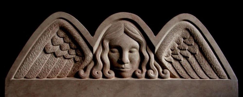
FURTHER READING: My analysis of the carved imagery on Henry and Anne’s Choir Screen at King’s College Chapel:
‘A re-appraisal of the iconography of the choir screen at King’s College Chapel’ Cambridge, published in Oxford University Press journal Notes & Queries

My interest in Anne Boleyn’s cultural, religious and political influence prompted an in-depth study of the choir screen in King’s College Chapel, Cambridge. I systematically recorded and decoded the carved iconography to reveal a pointed message that went far beyond a celebration of their marriage, as previously supposed.  Using imagery that contemporary viewers would have understood, the screen asserts Henry VIII and Anne’s Divine Right to rule over the Church of England and issues a very real threat to dissenters.

‘An index of the carved imagery on the choir screen at King’s College Chapel, Cambridge’
As well as publishing my analysis in Oxford University Press’s peer reviewed journal Notes & Queries I compiled an detailed record of the screen’s carved imagery which can be used by visitors to the Chapel, and as a basis for further research. I highly recommend such a study as I feel there is still much to be learned it:

‘Life, Death, Whatever’ – a celebration of the diversity of life and the universality of death.

771158sutton-house-little-chamber

Last night I attended the opening of an exhibition called ‘Life, Death, Whatever’ at Sutton House, a 16th century National Trust property in Hackney, London.

It was a fascinating assault on the senses – art, music, herbs, cocktails and poetry, and much, much discussion. Activities and installations were set up throughout the house, including a coffin filled with balls (as in a child’s play area) which you could chose to lie in (I chose not). It sounds wrong, irreverent, and yet the exhibition was so right.

sutton-house

Organised by Louise Winter (creative funeral planner sometimes referred to as ‘The Mary Poppins of Death’) and end of life doula, Anna Lyons, ‘Life, Death, Whatever’ looked at death and grief squarely in the face and prompted all manner of discussion. And that is as it should be, given that it comes to us all no matter ones tastes or sensibilities.

I have carved many headstones for individual clients, and over the past 8 years or so have perceived that the zeitgeist is changing. Instead of being asked to carve gravestones with names and dates plus decorative motif, I am regularly asked to make a sculpture…a private artwork that somehow expresses the character of the person they want to remember thereby.
Fewer people adhere nowadays to common traditions, whether through their religious affiliations or sense of social obligations within their neighbourhood. As a result of this (and some logistical/ red tape reasons) fewer people feel the need to mark the death of their loved one with a gravestone in their local church yard or council cemetery. Instead I receive a flow of commissions for  unique and highly personal sculptures, either to be kept within the hub of the home on desk  or windowsill, or in the garden, as a private, personal sanctuary – accessible both day and night.

It was a huge delight when, after years of resistance, I joined Twitter and chanced upon a whole crowd of individuals who are all, together or individually, following the same path -treating death with whole-hearted respect for the individuality of each person and how they chose to approach the end of their life, whichever path they chose.

‘Life, Death, Whatever’ and the movement that gave rise to this ‘in your face’ exhibition, is not morbid or irreverently ghoulish. Far from it, it is a warm celebration of life’s diverse vitality and offers a sense of empowerment to all.

life-death

Further review of this exhibition

How I achieve ‘flow’ in my carvings

Focus on silhouette

Alan Moore, author of ‘No Straight Lines’ and ‘DO/DESIGN Why beauty is the key to everything’ asked me to tell him about the carving process and to try and describe the elusive ‘flow’.  As a subject it’s big and pretty intangible, but I’ll try to describe both how I achieve flowing forms, and how this leads me to get lost in the flow of the process.

I’ll write another time about the mechanical, physical act of carving – the flow and twists of the chisel and the rhythmic beat of the hammer or mallet, but for now I’ll talk about what my eyes focus on while I’m working and how I lose myself within this narrow field of focus.
I haven’t tried to put it into words before so I hope it doesn’t sound like gibberish!

When I carve my eyes  concentrate on three particular things (often alternating quickly, but not at the same time).

1.The outline.  The outline of a form changes every time you shift your viewpoint. To use the analogy of a pencil sketch on paper – it is as if every time you shift, even just by a fraction, you have a whole new line drawing in front of you.
I scrutinise the whole of the  outline from one end to the other checking where there’s a break in the flow of the line.  I jump forward with a waxy builder’s crayon in my hand and mark the offending bump. Then I shift my body by a fraction, or turn the sculpture on the turntable, and scrutinise the fresh view that I have. When the sculpture is scrawled with crayon I chisel away the offending lumps and bumps, and begin again the checking process. I do this hundreds and hundreds of times until I am happy with the flowing outline. People looking at the completed sculpture might be unaware of the purity of the silhouette but will subconsciously sense the harmony that a flowing line creates.

2. The flow of the surface.  I try and figure out how the form should flow between the external outlines, whether concave or convex, or  moving from one to the other.
To picture this flow, imagine holding a piece of paper in both hands and flexing it in different directions. I try to get this flowing tension in my form.
The truth is, if you use the first way of looking – eradicating the bumps that disturb the flow of the outline, the surface of the form gradually sorts itself out. But generally carving is a mixture of these two processes.

3. Carving with Light and Shadow. This is the Grand Royale of carving. It almost guarantees that one will achieve flow – both in form, and as in a particular state of concentration. When I have this I work without pause, instinctively knowing what steps to take, fearlessly hacking away great chunks knowing that every thing will meet up harmoniously in the end. Ah, blissful state!
The way shadow falls across the surface describes the quality of the form. If the outline of the shadow is crisp and flowing, then you can be sure that the itself form is fluid and taut.
A good light to carve by makes carving simple – you just refine the shadow (which is strong and easy to see), and the form resolves itself :>)
Bright, clear daylight – preferably raking from the side as in early morning or late afternoon- is best. Alternatively site lamps are good, but best used in dark conditions.

I think daylight is best but I’m not sure if that’s because it is more subtle, or because it is mostly fleeting. A shaft of sunlight falling across my carving, highlighting a flaw that might never be caught again (not until the sculpture is installed in situ and it’s too late to rectify!) prompts avid activity, total absorption while the precious light shows me what I must do.
Though I have used the word ‘flow’ many times, here and in the past, my friend Susan Harper pointed out that this state has been closely analysed by the Hungarian psychologist Mihaly Csikszentmihalyi. You can read his understanding of Flow and listen to his Ted Talk (the latter half discusses flow).

I hope my description sheds some light on my carving process.

Postscript: If you feel inspired to carve, come on one of my Stone Carving Workshops  :>)


Watch my 6 minute PechaKucha presentation

Lucy 2 cropped

My fast and furious 6 minute PechaKucha slide-show presentation is now available to watch on-line. I found it hard at first to talk about such a sensitive subject as memorial commissions – with a raised voice to a large audience – but after a faltering start, I find my pace and cover many points.

**If you like my PechaKucha presentation, please click the black hand symbol by the slide-show – my commissions come from all over the world, and ‘applauding’ my work will help reach a wider audience.

Many thanks! :>)

If you haven’t already, you might like to read the post I wrote about how preparing for the presentation prompted a huge and useful stock-take of my work and the direction I’m going. I thoroughly recommend that everyone should take part in such a distilled presentation of themselves!

Fallen – the ongoing story of Chris Seeley’s memorial

Polar Bear in situ with flowers

You might recall an earlier post about the Sassy Bear memorial honouring my  school friend, inspirational artistic innovator Chris Seeley.  Alas, last week’s wild storms brought great trees crashing down throughout the country – and one fell directly on to the memorial wreaking much damage.  The bear’s strong and sturdy neck was broken off, as was her outstretched paw.

Fallen

Luckily, I am able to call in the services of another friend, the very able conservator Sarah Healey-Dilkes! With much experience under her belt, (for the V&A and as a free-lancer) Sarah is confident that Sassy Bear will soon be put to right and sashay onward, head held high, for years to come.

Chris’s husband Geoff suggested that the Japanese art of Kintsugi might be used… That is, making the repair itself visible and precious by using an adhesive material  mixed traditionally with powdered gold, silver or platinum…It treats the breakage and repair as part of the ongoing history of an object, rather than something to play-down and disguise.

Of course, many issues need to be considered when repairing an outdoor stone object (such as the effect of weathering over time), so Geoff and Sarah will have to weigh up the different methods of conservation.

In the meantime Geoff, who is a professional storyteller,  has woven fine gold out of this sad accident..  I’d like to share the beautiful poem that he has written in response:

Fallen
When the tree fell in the night,
did your bear-heart tremble
at its terrible declension?

When it struck your broad neck,
did you cry out in reproach
at nature’s sacrilege?

Did the forest weep for sorrow
as your magnificent head
crashed to the floor?

And what of those who love you,
brought to disbelieving tears
by your shattered limbs?

We remember the old songster:
there is a crack in everything,
that is how the light gets in.

So we will tend your wounds,
and make you whole again
with seams of gold.

The beauty of brokenness
is the only poetry
I care for now.

Geoff Mead  |  Kingscote  |  22 November 2015

I gave a PechaKucha presentation and so can you! :>)

Photo by Maarten Steenhagen

PechaKucha 2When Jon Torrens asked me if I’d like to take part in a PechaKucha event I knew I’d been offered a publicity gift-horse I’d be a fool to turn down (no matter how hard my fear begged me to do so).  What I didn’t realise was that preparing the talk would be a transformative experience in itself, bringing benefits that went way beyond a publicity shot.

‘Talk about yourself and your work’ sounded innocuous enough, but it prompted serious soul-searching -‘What exactly do I do?’.
On one level this question is easily answered – ‘I’m a stonecarver/ sculptor…I sculpt stone’…. but that answer wouldn’t fill up the allotted 6 minutes 40 seconds, or be very enlightening.

The  20/20 format (20 slides on screen for 20 seconds each) requires more than just the bare bones – but not much more. What’s needed is much thought – and a very distilled response.

My prep notes felt more like a haiku, though I’m sure my delivery was less succinct and more garbled (I haven’t had a chance to listen to the recording yet, and nerves erased the whole experience from my memory).  However, I found that jotting down thoughts had enabled me to see threads running through my work, which I hadn’t seen before, or needed to verbalise – even to myself.

The slide shows and accompanying voice-overs will go on line in the next fortnight,  but I’ve already got more than I could have hoped for from the experience – a prompt for self-scrutiny , followed by feedback from a warm and welcoming audience.   Who couldn’t profit from that?

I heartily recommend PechaKucha to anyone –  as a participant or as a curious on-looker, by coming to an event at your local venue or watching on-line.
Check out the global PechaKucka site for more info.

My presentation and those of the 5 other participants will be on line by the end of November. See PechaKucha Cambridge

PechaKucha 1

Why take a sketch book when you look at sculpture?

Barbara HepworthIf you haven’t gone yet, and you possibly can – take this last opportunity to see Barbara Hepworth’s exhibition at the Tate. And if you go to see this or any sculpture – take a sketch book and pencil.

Why?

I thought about this as I scribbled furiously, and here are my thoughts;

Looking at sculpture and not sketching is like listening to music and not dancing. Your mind will take in the details, but there it ends. (ok, I want to say ‘but not your soul!’, but that’s not everyone’s cup of tea). What is certain is that trying to record a sculptural form with lines and scribbles and notes makes you look at the object 360 times more intently.

You might want to sketch, but be scared that ‘people will think you look poncey’. Feel the fear and do it anyway! You will be so absorbed with your task that a whole herd of cows could come into the gallery (and judge you) and you wouldn’t notice or care. You will feel great.

The sketches that I am urging you to make are private studies, not intended as artwork in itself, though they might be beautiful in their own right. The point is the process, not the outcome. Even if you never looked again at your scribbles, they will not have been a waste of time: its the act of looking, trying to understand the piece and capture it’s essence that is of value.

There are so many things to look at at once, and addressing each question on paper shows how the different elements relate to each other as a whole. Here are some things to consider when you scrutinise  a piece of art  (and remember much will change each time you shift your viewpoint –

  • What is the outline of the sculpture?
  • What shape the negative spaces? (ie, the gaps between the solid forms).
  • How does the shadow fall across the sculpture, and how does this emphasise the form?
  • Notice the texture. Are the tool marks left from the carving process, or were they added deliberately for effect?
  • Is the piece trying to be a realistic representation? What distortions has the artist made – were these deliberate to emphasis the mood of the piece, or just a failure in translation?

At this point it’s not just about the piece as a physical object but as an artwork made by someone, and how you relate to it on a personal level. If you don’t do this already, here are a few questions you could ask yourself whenever you look at and assess a piece of art-

  • Do I like it?? Whether yes or no – why?
  • What is it trying to represent? Has the artist succeeded?
  • If the sculpture represents a living being , can you tell if they were old or young, thin or curvaceous? In a calm repose, or poised for action?
  • Do you feel pulled to walk around the sculpture to see what is going on on the other sides? Does it work ‘better’ from one side or another? (Hopefully not, in my opinion)
    and most importantly –
  • Does it have a sense of life to it, or does it merely look like a study of something else? This is a really important question. A piece of art could be exquisitely made, but lifeless – or badly put together, but you don’t care – it makes you feel something, it makes you believe in it’s right to exist.

my sketch of BH

I like to take a rotring pencil with me (0.7, H or HB) as they stay nice and sharp. Don’t bother with a rubber as it’s all about the journey and redrawing, redefining your record, adds to the story. Enjoy :>)


Autumn update – the early stages of my new commission

I haven’t uploaded images of my ‘Mother and Daughter’ sculpture, nor my carvings over the summer.  But instead of catching up now I shall leap-frog on and post some photos of the early stages of my next commission – a pair of sculptures for the foyer of a hospice.

Under wraps

Here is tantalising glimpse of one of my maquettes…She’s wrapped in moist cloths as I am having to put her aside while I hold a Stone Carving Workshop in my studio this weekend. And below are samples of the red sandstones that I have been considering.

Sandstone samplesStone sourcing involves a lot of phone calls to quarries and stone suppliers to check the availability and quality of their stone. Quality and availability can change from month to month, depending on the geology of the patch of ground being quarried. A new seam of rock at the same quarry might yield stone  of a radically different appearance – bands of different colours and textures can criss-cross a block, a bed of shells might appear, or dark speckles scattered throughout what was previously pure and uniform.  Yet both stones are from the same quarry and are sold under the same name. So asking the stone supplier for a current sample is essential before deciding which stone to use for a new commission.

Having fallen in love with a particular shade of stone the next step is to find out whether that particular stone is quarried in blocks of sufficient size – sometimes a stone might only be available in shallow strips (whereas a few months previously it might have been available in large blocks).

I was very keen to use a warm-coloured stone, with interesting natural qualities, for my new project. I generally tend to avoid Portland (that star-of-availability, consistent texture and vast bed-height) because it can seem too cold and formal, (too ‘noli me tangere’ for my taste) – though for many reasons it is the perfect choice especially for large, outdoor commissions). I don’t like carving sandstone because the dust is bad for the lungs so one has to wear a dust-mask throughout, and the rough grit blunts tools in the bat of an eye. However, it comes in beautiful shades that just can’t be found in limestone.  I’ve plumped for a warm, rosy red which sparkles in the sunlight…

Watch this space…  :>)

I was very moved by the New Rhythms exhibition at Kettle’s Yard (Gaudier-Brzeska and co)

hgb_k

If you possibly can, make every effort to go to Kettle’s Yard in Cambridge this weekend to catch the  New Rhythms exhibition.  It shows the influence of dance and wrestling on artists in London immediately  prior to the First World War.

The Dancer 1913, cast 1965 Henri Gaudier-Brzeska 1891-1915 Presented by Sir Edward Beddington-Behrens 1965 http://www.tate.org.uk/art/work/T00762

Gaudier-Brzeska – The Dancer (1913)

The exhibition is brilliantly curated  –  even though I was familiar with the artwork on display I saw it in a dramatically new light. Well-known sculptures by Henri Gaudier-Brzeska, Jacob Epstein and Alexander Archipenko are shown alongside hastily scribbled sketches of movement and Futurist paintings by a number of their contemporaries.

imgres

Gaudier-Brzeska’s Dancer, study (1914)

However it was the inclusion of a stunning film shot in 1912, ‘La Danse des Apaches’ that (I felt) brought the whole exhibition together.  At one point I put my hand to my chest, concerned because my heart was pounding so hard – it took me a moment to realise that I was just experiencing a rush of pure excitement.

images129315452858047051_58a103e8-2571-4b08-82ba-05839a69dda1_205123alexander-archipenko-dance-1912posthumous-cast-1967-artsy-1387735270_org
A
lexander Archipenko’s The Dance (1912-13) needs to be seen in the round to be appreciated fully – the internal space between the figures is as interesting as the forms themselves, and changes with every new viewpoint. It’s worth going to the exhibition for this piece alone.

The grainy, black & white film showed Beatrice Collier and Fred Farren in a dance that was sometimes passionate and rhythmic like an impromptu Tango, and at other times what seemed to be a distressingly brutal fight. Apparently this form of dance was a craze that took Paris by storm in 1908, ‘inspired by the gang culture and sexualized liaisons of the Parisian underworld’.  It made the posturing of Punks such as Sid Vicious and Nancy Spungen in the 1970’s look limp and half-hearted.

159d6f5654c4b536c0886858ab0e80e5

The extraordinary dance footage gave a glimpse of the strange energy and sense of unrest in Europe prior to the First World War. It increased my appreciation of the angular forms on display, and also why many artists flocked to experience the drama of war on the front-line. When you look at the work on display it seems utterly inevitable.

See: http://www.kettlesyard.co.uk/events/new-rhythms-henri-gaudier-brzeska-art-dance-movement-london-1911-1915
/

henri-g_1510064a